
|
|||||||||||||
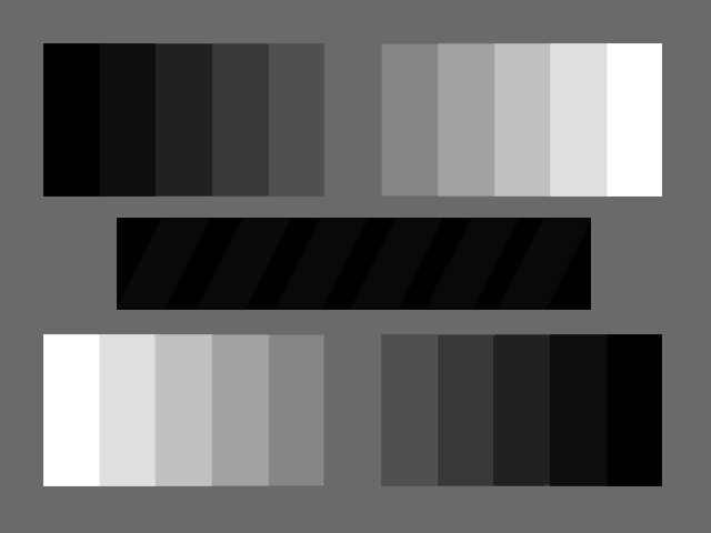
Color Management, Grayscale Charts and Monitor Adjustment Color Management. In an effort to prepare digital images that meet industry standards as well as client expectations with regard to color and consistency, we have adopted the following standards. When working with digital images, the RGB space we work in is "Adobe RGB (1998)". To calibrate our monitors we use Colorvision's SpyderPRO and its accompanying OptiCal software, with a color temperature of 6500K (D65) and gamma of 2.2. Monitor Adjustment. It is important to have your monitor adjusted properly in order to view our photographs or, for that matter, any website which displays images for which an effort is made to control color in a consistent, industry standard manner. (Yes, we realize that color management is still, in many ways, an elusive thing.) This means setting your monitor, either with its built-in on-screen controls or through software, so that the grays are rendered without any color cast and so that you can discern detail in shadows (at the darkest parts of the charts below) and in highlights (at the brightest parts of the charts below).
The grayscale chart above shows gradations of neutral gray from pure black to pure white. You should be able to discern differences in each gradation of gray, with the possible exception of the two or three darkest levels. There should be no color cast to any of the levels. This chart is created by changing the RGB colors in lockstep by increments of 8, e.g., (0,0,0), (8,8,8), (16,16,16), ..., (255, 255, 255). Or you can do it by incrementing the HSB values by about 3 each step, e.g. (0,0,0), (0,0,3), (0,0,6), ..., (0,0,100).
The grayscale chart above, similar to the top one, shows all 256 levels of neutral gray in a horizontal sweep. Each gradation is a single pixel wide.
The above chart shows gradations of gray from 0% (pure black) through 10, 20, 30, 40, 60, 70, 80 and 90% to 100% (pure white). The surrounding area is 50% gray. The black bar in the center has diagonal stripes of 7% gray -- can you discern them from the pure black in which they are set? Try reducing the brightness of your monitor so that the stripes just blend with the black, then raise the brightness one notch -- all while maintaining the integrity of the pure white.
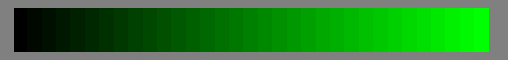
The above color charts are similar to the grayscale chart at the top, which showed even gradations of neutral gray from darkest (black) to lightest. These show even gradations of pure red, green and blue. You should be able to discern each gradation at the bright end. Ideally, you should also discern each at the dark end, but the darkest several levels of any one color may blend together.
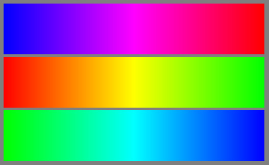
Above is another, perhaps useful, color chart. Note that the right hand extent of each bar shows pure red (top), green (middle), blue (bottom). |


